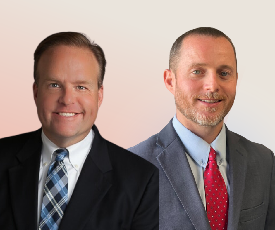
In this live-recorded episode, Jim and Tyson, delve into the intricacies of managing a law practice. They discuss the critical role of honest self-assessment in recognizing a firm's downward trends, such as cash flow issues and ineffective marketing.
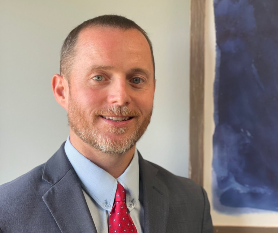
Design Principles that Convert with Brendan Ruane
Subscribe
Are you overwhelmed by the amount of information bombarding you every day? In this episode, Brendan Ruane shares valuable design principles that can help you cut through the noise and convert potential clients. From keeping language simple to following familiar website design conventions, Brendan’s insights will revolutionize your approach to marketing.
Discover how to optimize your website navigation, highlight important elements, and leverage the power of social proof. Tune in now and take your legal career to new heights!
Episode Highlights:
02:13 The importance of simplifying websites and marketing materials to avoid overwhelming users and cluttering up information
04:00 Design principles that convert: Jacob’s Law and familiarity in website design
09:05 Whittle down information to give users what they need to make decisions and take actions
14:02 Focus on the first two sections of your website as they receive the most attention from users
15:59 Use credible testimonials and videos from past clients to build trust and credibility with potential customers  Watch the full video on YouTube here.
Connect with Brendan:
Resources:
-
- Join the Guild Membership
- Subscribe to the Maximum Lawyer Youtube Channel
- Follow us on Instagram
- Join the Facebook Group
- Follow the Facebook Page
- Follow us on LinkedIn
Transcript: Design Principles that Convert with Brendan Ruane
Speaker 1 (00:00:00) – So in today’s episode, we’re sharing a presentation from Max Lakhan 2022. Keep listening to hear Brendan Ruane as we share his talk. More leads same budget design principles that convert. You can also head to the maximum lawyer YouTube channel to watch the full video. Now to the episode.
Speaker 2 (00:00:18) – Run your law firm the right Way. The right Way. This is the Maximum lawyer podcast podcast. Your hosts, Jim Hacking and Tyson Metrics. Let’s partner up and maximize your firm. Welcome to the show.
Speaker 3 (00:00:40) – Good morning, everybody. If anybody sees what I have in my hand here, is anyone know what this is going to be? Recognize these. So kush balls, these are something that people are familiar with, right? You’ve seen them back in the 90s. They were all over the place. You get them in different colors. So this is going to play into some of the things we’re going we’re talking about design principles that help to convert. First we want to talk about is zipf’s law. You hear a lot that people are lazy, right? Oh, these people are just lazy.
Speaker 3 (00:01:09) – They don’t really read it. They don’t do this. You know, they’re not really paying attention. It’s actually not true. If you look at this law, basically what it says is that every day we are so bombarded by information that we are reading the equivalent of The Hobbit every day. That’s just scrolling on social text messages. Websites are on everything like that. Think about how big one of those books is. So it’s not that people are lazy, it’s just that they’re overwhelmed with the information that you’re actually putting out there. So how can you take this and use this to your advantage? You want to make sure that you keep your language simple. You want it to be easy to digest. You don’t want to give people more than they need to actually do. One of these things is generally you hear you right at an eighth or ninth grade level. People who are more intelligent are just going to read faster and it will actually help you get more people to be able to comprehend your information, grouping things together in easily diagnosable chunks on your sites or on any marketing materials.
Speaker 3 (00:02:13) – Actually using can be helpful because people can see, Oh, this goes together, this is what I need to know and this is the information I need to get. Because in everything that we’re doing, we are taking information and trying to get somebody to take a specific action, whether that be fill out a form on your website, whether it be click to call, you’re trying to convey information to get those people to convert for you. If you’ll see the principle of least effort, you don’t want to overload these people. Make it as simple as possible. For far too many sites have too much going on when it comes to this. How many of you have a chat widget on your website? Show of hands Now when you have a chat widget, generally you have one like it’s in the bottom right hand corner on your page. Do you guys also have that one that’s on the left hand side, halfway down the middle of the page? It’s very common. I know N-gage has that where it’s on the left hand side and you have it down in the bottom corner.
Speaker 3 (00:03:05) – Now I understand. Oh, we want to get them to chat, but you’re just adding more and more layers over the top of the information that people are trying to actually get. You know, there are some ways you can do things in only putting that on the home page where you may not have really dense information. But when you get further down into pages that have information that people are trying to get, you don’t want to clutter it up. Not all designers are going to be amenable to you coming back to them and saying, hey, we need to take things away. We need to simplify our site because some designers can be very opinionated about their designs, but you’re going to find that it’s actually going to the more that you can simplify your site to make the information that you want to stand out the most in that particular page, you’re going to be better off. Jacobs Law. And in this one, this comes from Jacob Nielsen of the Nielsen Nieman Research Group. It’s a UX design research group.
Speaker 3 (00:04:00) – And this law basically states from people are on websites all the time, right? Everybody understands there’s basic things with a website. People are familiar with things that are on a website. This is something that could be familiar to you if you’re of a certain age. You saw crucibles, you know, when they were all the rage in the late 80s, early 90s. So something that is familiar to you. So what we want to do when it comes to designing sites, we don’t want things to necessarily be snowflakes. We don’t want them to be completely outliers. You don’t want something that breaks the mold. What I mean by this is everybody probably has a website where your logo is in the top left of your website when it loads, usually on the top right, you’ve got some kind of call to action, whether it be click to call, it says free consultation, something like that. And then you have your menu in the middle with the pages that people would get to. People understand that they read it left to right.
Speaker 3 (00:04:55) – Obviously in, you know, in Western countries you’re reading left to right if it was. Other countries would be right to left, But having your website design that way makes sense. The only reason to break that convention is for a very specific purpose. You want to keep that the same. It’s something that gives people comfort. People are always we’re programmed to find patterns. It’s just the way we’re wired. And so having something that looks different is jarring. It makes people uncomfortable. And the last thing you want to do is make people uncomfortable on your website. A really good example of when this rule is broken and it works is the New York Times website. If you’ve ever seen The New York Times website, The New York Times logo is dead center in the page. But there was a very specific reason why that was done when The New York Times first went online. They wanted the homepage, the hero section, the top section of the page above the fold to look as much like the physical newspaper as possible.
Speaker 3 (00:06:04) – And the masthead for The New York Times was the Times logo right in the middle of the newspaper. So there are times when you can break this rule, but it needs to be done for very specific reason. You don’t want to do something just to do something different because it may cost you familiarity with people. Users prefer that sites work the same way they prefer. Oh, I know this is where a menu is. I know if I click on the logo, it’ll bring me back to the homepage. There’s a lot of people out there that don’t know that on almost every website, if you click the logo, it will bring you back to the homepage. And it’s why a lot of people have a home link in their menu structure, whereas it’s sort of redundant because it’s usually right next to where the logo is. But it is something that some people put up there. Next, we want to talk about Hicks Law. This again goes back to keeping things simple, so I’m going to get a little interactive here.
Speaker 3 (00:07:07) – John Fisher What do you want to eat for dinner tonight? Well, that was very specific, but you surprised me with that one. But generally what happens is this If I said, Hey, what are we going to have for dinner tonight? You start thinking and like, okay, well, where are we going to go? Like we’re here, so where am I going to go? What options do we have? Are we going to go to a sports and get the pretzels and the nachos? Because, by the way, they’re pretty good. But are we going to go across the river and we’re going to go to Mission Taco or one of the places that are Changs or something that’s over there. One of the things with Hicks law is what you want to do is you want to give the least amount of options possible for somebody to make a decision. So if I said to you, Hey, we’re going to P.F. Chang’s for dinner after this and we’re only getting appetizers, it’s much easier for you and your mind to think, okay, what do I want to eat? That’s an appetizer that they would have at P.F. Chang’s.
Speaker 3 (00:08:04) – And you need to keep this in mind when it comes to your sites. You want to, you know, keep it simple, stupid. I’ve seen a ton of websites that when you go to their main menu structure, they’ll have, you know, practice areas and then other practice areas. They’ll have personal injury, criminal defense, trusted estates. And then under personal injury, they’ve got 14 other things and then they’ve got every subpage of that page. What you really want to do is you want to look at things and say, if somebody is coming to this website, what information do they need to get and where do I need to get them to? You don’t need to have the person who is concerned about a personal injury case say it’s a car accident. Case doesn’t need to see all of the other sub pages under criminal defense. They don’t need to see the trust and estate’s pages. So by having somebody have a limited scope of options and say, okay, I want to go to personal injury car accidents.
Speaker 3 (00:09:05) – So if they go to personal injury, they can click on that page, They can go to car accidents. Now, in the personal injuries silo of content, your menu can then have all of those different personal injury type cases that you may have, but you don’t need to show those necessarily on the home page to get somebody to get to that point. So you want to make sure that you’re not, again, overloading people with information. This goes back to the Zipf’s law. We see so much information, whittle it down to give them the things that they need to make the decisions that you want to take, the actions that you need them to take. It’s a principle of progressive exposure. So it’s like, okay, we’ve got these many options. Then from there you get these many options. Then from there you have these many options and it really cuts down on the clutter that’s on your site and it makes it much easier for people to navigate.
Speaker 1 (00:09:55) – The Gilda’s Maximum Lawyers community of legal entrepreneurs who are taking their business.
Speaker 1 (00:09:59) – And lives to the next level. As a guild member, you’re granted exclusive access to quarterly in-person events around the country. The next mastermind is coming up on July 20th and 21st in Denver, Colorado, featuring hot seat sessions and personal coaching with renowned performance coach Jason Selke. This event will give you the opportunity to work directly with Jason, who has helped countless high performing individuals and teams reach their full potential. During the hot seat sessions. You’ll gain valuable insights and learn strategies to help you overcome the challenges you’re facing in your practice. For a limited time. You can get your ticket at the lowest earlybird price head to max Lot events to join now and reserve your spot at the upcoming Guild mastermind.
Speaker 3 (00:10:43) – The next thing we’re going to talk about relates a lot to the design that’s actually on the site itself. And this is the principle of figure and ground. So anybody who was here last year saw the color theory presentation with the crazy colors that were, you know, on the screen and you were seeing things that weren’t there.
Speaker 3 (00:11:01) – And this is somewhat similar. So what I’m going to do is I’m going to throw the next slide up and I just want you to take a, you know, a couple seconds to just really look at it, because I’m going to have some questions for you guys after we’re done. So just take a look at this. It’s a pretty stock image. You can find it pretty much anywhere online. And this is considered this is using something called figure and ground. So in this image, how many of you guys see a vase or a table base? How many of you guys see two faces looking at one another? Okay. So in this one image, you can see two totally different things. Now, this accompanied with these principles, accompanied with that color theory that I talked about last year, You can use these things to make things really stand out on your page, which is using you positively. Or if you’re doing this incorrectly, you can make things shrink away and people not see that. If you wanted people to see two faces here, well, you’re making a mistake because with the shading and the way it’s done, some people are seeing a vase.
Speaker 3 (00:12:04) – So you want to keep that in mind when you’re actually getting into the relationship between what’s in the foreground, what’s in the background. This is where you can use, obviously, your call to action colors, but this is also where you can use different shades. You can use some drop shadows, things like that to really make the things that you want them to do to stand out. One of the things that is really common is in the middle of your copy on a page, you may have a call to action. Well, you want that to either be have a slightly different background color so it stands out from the page. You want to maybe drop shadow using those different aspects are really going to help you pinpoint the things, but you don’t want to use that all over the place. You don’t want to have that same color, you know, in your sidebar menus and have drop shadows there and all this other stuff you wanted to use it in using figure and ground in the places you really want certain things to pop out.
Speaker 3 (00:12:54) – Okay. So now next, this is probably the one that most of you guys have actually heard of before. The Pareto Principle. This is the, you know, the 8020 rule. It’s definitely something that most people, if you’ve been to any conference you’ve heard about. But one of the things that you need to keep in mind is that in studies online, 55% of searchers are spending their time above the fold. So the first half of the page when, you know, when the page loads and 75% of the time is actually spent on the top two sections. So keeping that in mind and using the 8020 rule, you realize, okay, well, I may have this very long homepage, but the section where I need to spend the majority of my time is in these top two sections. Because in these top two sections, it’s 75% of the time that is on the page. So you need to be really, really careful at what you put in those first two blocks on your websites. I see a lot of sites that have they’re not using it, the hero section and then the second section below it as effectively as possible.
Speaker 3 (00:14:02) – Those are your moneymakers. Those are where you want to have the basic information that you need to get across to somebody. Clear, concise, easy to find, get the whatever that page is trying to get across to somebody. That’s where you need to actually do it. In those top two sections, everything else is great. All that supporting information, the additional content is great, but you need to understand that the vast majority of people on a page are going to stay in those top two sections. And so if you were going to spend any time really tweaking things, those are the areas that you want to actually get into. So by focusing on those, you’re not going to get bogged down in overanalyze every little thing on your page. Like if there was something towards the bottom of your page and you’re like, Oh, we need to tweak this. We tweak that. It’s not going to be worth your time. You really want to focus on the things that are higher up on the page. Now, if there is something on your page that you know.
Speaker 3 (00:14:59) – From your metrics is converting. People say it’s a list, say you’re on the personal injury page and it’s a list of all the other car accidents, truck accidents, TBI, any of those things. If that’s where you’re getting a ton of clicks, you may want to take that section and move that section up on the page to the first or second section because you know that is your moneymaker section. Every site is going to be different. But all of the data suggests that the top two sections are where your most important information needs to be. The last thing I’m going to touch upon today is social proof. It’s funny, as people, we tend to be cautious. Even, you know, people here consider themselves risk takers. We tend to be cautious. And one of the things that you need to understand is that we’re much more likely to do something if we’ve seen someone else do it before, and if that person is somebody that we actually think is a credible person. This is the entire point of this conference.
Speaker 3 (00:15:59) – You guys are coming here as entrepreneurial attorneys to see and hear stories from other entrepreneurial attorneys who have done the thing before. And you guys are going to leave here with lists and lists. I mean, Seth’s going to have a list like 40 pages long of things he wants to implement in his firm. And it’s because you’ve seen people that you know, like and trust who are getting up here, who are telling you their experiences, who you’re talking to at dinner or at the cocktail hours and things like that, what they’ve implemented and how they’ve done it. You might have had all of these things on your to do list or somewhere in your mind that you wanted to do. But when you leave here on Friday, you’re going to be really amped up to get these things done, because now these people who are up here have given you this social proof. Okay, so how can you actually use this for yourselves, for your firm? Well, what you really want to look at is who you are actually using for your social proof on your site and how you are telling their stories.
Speaker 3 (00:17:04) – You know, text based reviews are great. Everybody needs them. But if you want to do things that are really effective to really drive home with people, the ability to do video and get reviews from past clients, that humanizes them, that actually tells their story and allows you then to make that connection with the person on your site. I know there’s a couple of you here that have these types of testimonials on your websites and they are extremely powerful because when you have somebody who can hear somebody else’s story, see themselves in that person, that person’s social proof of saying that you’re the lawyer to talk to you, you’re the one that you want to handle. That case is amplified even more. So keep in mind the people that you’re highlighting need to be people that people either inherently are going to place value in or you have to tell their story in a way that will allow them to build that value to your potential customer. That is it for today. I know everybody’s probably itching to get to lunch. If you have any questions or anything, you can email me.
The post Design Principles that Convert with Brendan Ruane appeared first on Maximum Lawyer.
Guild Membership
Meet us in Scottsdale, Arizona! The first quarterly mastermind of 2023 has tickets available! Become a member to purchase your ticket.
Join the MembershipFree Access to Stage 1 of Maximum Lawyer in Minimum Time
Sign Up Today!Customer Reviews
4.9 out of 5
Amy McGarry Law Office, PLl, 05/23/2023
Amy McGarry
I listen to every podcast, Saturday morning shows, HotSeats, etc. The information and ideas I learn from
each one. I may only receive a nugget of information, or feel encouraged that I am not the only one
going through something.
Harlow law office ltd, 04/21/2022
Jennifer Harlow
The podcast and fb group has been life altering. I always felt like I would never know enough to hang my
own shingle and employ people, but here I am, killing it. Lots of actionable steps for working on mindset,
business (some I had to go outside of law to learn) and really gathering attorneys who are willing to
share and lift up others, as opposed to tearing other attorneys down. I first heard about the podcast on
Ernie the Attorneys podcast and how they were doing amazing stuff. And they continue to do so. Now if
we could bring back maxlawcon I’d be over the moon.
Phil from AMEC, 04/17/2022
AMEC 2022
My name is Phil and I just met Dr. Renee Darko at AMEC Conference. Her energy was radiant and inviting; similar to how it is on the show. Drs Nii and Renee Darko are doing amazing
Psychcvb account, 03/02/2022
Yo Nii
Love the show especially first generation or first in family physicians!! Stories of the hard work, bus rides to prerequisite classes etc.. Digging out of school debt then making
Join Our Facebook Group
If you want to discuss current events or ask for help from other thought-provoking legal professionals, join our Facebook. Stay tuned for updates.
Become a MemberYou Might Also Like
of Your Law Firm?
 Struggling with the Vision of Your Law Firm?
Are you a law firm owner who is struggling with mapping out your goals? In this episode of the Maximum Lawyer Podcast, co-host Tyson Mutrux explores the critical role of having a clear vision for both your law firm and personal life.
Carriers with Jim Andrews
 Precedent: Rethinking How Claims are Settled Between Law Firms and Insurance Carriers with Jim Andrews
Are you looking for a way to streamline your law firm’s efficiency with claims? In this episode of the Maximum Lawyer podcast, Becca Eberhart chats with Jim Andrews about his innovative platform, Precedent, which aims to improve the efficiency of attorney-handled claims.
Enjoy Exclusive Access To Stage One Of The Maximum Lawyer In Minimum Time Course
We only send you awesome stuff =)
Privacy PolicyPrivacy Policy
This privacy policy has been compiled to better serve those who are concerned with how their ‘Personally Identifiable Information’ (PII) is being used online. PII, as described in US privacy law and information security, is information that can be used on its own or with other information to identify, contact, or locate a single person, or to identify an individual in context.
Please read our privacy policy carefully to get a clear understanding of how we collect, use, protect or otherwise handle your Personally Identifiable Information in accordance with our website.
What personal information do we collect from the people that visit our blog, website or app?
When ordering or registering on our site, as appropriate, you may be asked to enter your name, email address or other details to help you with your experience.
When do we collect information?
We collect information from you when you register on our site, place an order, subscribe to a newsletter, Use Live Chat, Open a Support Ticket or enter information on our site.
How do we use your information?
We may use the information we collect from you when you register, make a purchase, sign up for our newsletter, respond to a survey or marketing communication, surf the website, or use certain other site features in the following ways:
- To personalize your experience and to allow us to deliver the type of content and product offerings in which you are most interested.
- To improve our website in order to better serve you.
- To allow us to better service you in responding to your customer service requests.
- To quickly process your transactions.
- To send periodic emails regarding your order or other products and services.
- To follow up with them after correspondence (live chat, email or phone inquiries)